Real-Time Graphs and Data Visualisation!

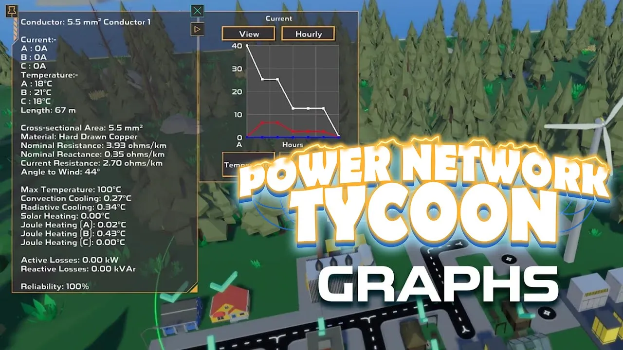
Who doesn’t love data? Watching your power grid come to life is one thing, but seeing it perform over time adds a whole new layer of depth. Based on feedback from players asking for better ways to understand system performance, I’ve added real-time graphing to help visualize what’s happening.
What You Can Track
Now you’ll see graphs that track key metrics in real time. These include things like:
- Current being drawn
- Temperature of conductor/substation etc
- Power (active power or apparent power, depending on the asset)
- Battery charge levels
These graphs update live as your network runs, so you can spot spikes, dips, and optimise solar panel directions etc. Whether you’re optimising efficiency or trying to figure out why the lights just went out, this should give you a powerful new tool.
A Visual Window Into the Grid
The game itself is built in Unity, which itself doesn’t have a nice plug-and-play graph tool. I tried a few things to try to get the graph to work how I wanted it to but what I ended up using was a combination of dots and lines. The dots show the data point and a line would be stretched between the dots. In some cases such as for each phase on a conductor, I was also able to change the color of them to show more data on the one graph.
What’s Next?
I’m planning to expand the graphing system to include overlays, history logs, and maybe even export options for the data nerds out there. If there’s a specific stat you’d love to see tracked, let me know.
Get Power Network Tycoon
Power Network Tycoon
Build and manage the ultimate power grid on a developing island using real electrical physics simulation methods
| Status | In development |
| Author | David Made This |
| Genre | Simulation, Educational |
| Tags | City Builder, electrical, energy, engineering, Indie, Low-poly, Physics, power-grid, Procedural Generation |
More posts
- Tutorial Videos, OpenDyslexic Font and More76 days ago
- Power Network Tycoon - Boost Points, Font Options and More76 days ago
- Balancing Complexity and Clarity: Making a Systems Game PlayableAug 06, 2025
- Eat, Sleep, Program, Repeat: My Daily Routine working on Power Network TycoonJul 30, 2025
- Autosave, Settings Customization and MoreJul 30, 2025
- Level Of Detail (LOD) and Performance OptimisationJul 23, 2025
- Massive Endgame Update: Conquering the Legacy Save File ChallengeJul 09, 2025
- Minor Bug Fixes and ImprovementsJul 03, 2025
- Minor Bug Fixes and ImprovementsJun 27, 2025

Leave a comment
Log in with itch.io to leave a comment.